22 April 2016

Female ASA presidents

I recently received an e-mail from the American Statistical Association (ASA) about the Helen Walker Society. The e-mail listed the 14 “distinguished women leaders who have held the office of ASA president” going back to Helen Walker in 1944.

Really? Fourteen? All the way back to 1944? Wow.

I thought it would be interesting to visualize the percentage of female ASA presidents over time. I found a spreadsheet of past ASA presidents online and used the data to create a timeline. (R script shown.)

# download file
library(XLConnect) 
url <- "http://www.amstat.org/about/pdfs/History_of_ASA Presidents-JSMs.xlsx" 
local <- tempfile() 
download.file(url, local, mode='wb') 
wb <- loadWorkbook(local) 
dat1 <- readWorksheet(wb, sheet=1)

# keep first three columns and valid rows
dat2 <- dat1[, 1:3]
names(dat2) <- c("Year", "Number", "President")
dat2$Year <- as.numeric(dat2$Year)
dat2 <- dat2[!is.na(dat2$Year), ]

# fill in empty rows
library(zoo)
dat2 <- na.locf(dat2, fromLast=TRUE)

# add sex
dat2$Sex <- ifelse(dat2$Year %in% c(1944, 1952, 1956, 1980, 1987, 
  1989, 1992, 1996, 2006, 2007, 2009, 2011, 2013, 2016), 
  "Female", "Male")

Most recent 10 years of ASA presidents.

Year Number President Sex
2017 112th Nussbaum, Barry Male
2016 111th Utts, Jessica Female
2015 110th Morganstein, David Male
2014 109th Schenker, Nathaniel Male
2013 108th Davidian, Marie Female
2012 107th Rodriguez, Robert N. Male
2011 106th Geller, Nancy Female
2010 105th Pantula, Sastry Male
2009 104th Morton, Sally C. Female
2008 103rd Lachenbruch, Peter A. Male

I then calculated the rolling 10-year percentage of ASA presidents that were female and plotted the results.

# 10-year rolling mean
mean10 <- 100*rollmean(dat2$Sex=="Female", 10, align="left", fill=NA)

# plot timeline
# par(mar=c(4, 4, 3, 1), las=1)
# plot(dat2$Year, mean10, type="n", xlab="Year", ylab="Females  (%)", 
#   main="Rolling 10-Year Percentage of Female ASA Presidents")
# abline(h=50, lty=2)
# points(dat2$Year, mean10, type="o", pch=16, col="orange")


There were three female ASA presidents between 1944 and 1956, followed by a 23-year period during which all the presidents were male (1957-1979). Since then, the percentage of female ASA presidents has risen, reaching 50% for the first time during the 10-year period from 2004 to 2013. Excellent.

09 April 2016

Wisconsin presidential primary

I was curious about the Wisconsin primary election results. I wanted to see how the votes stacked up among Democrats and Republicans. I also wanted to see how both parties compared to the number of eligible voters that didn’t vote.

I downloaded election results from WisconsinVote.org on 8 April 2016. According to Wisconsin’s Government Accountability Board, the State of Wisconsin has 4.44 million eligible voters, of which 3.39 million were registered by 1 April 2016.

Democrat Didn’t Vote Republican
Sanders 567,936 0 0
Clinton 432,767 0 0
Other Dem. 3,201 0 0
No Vote 0 2,334,973 0
Cruz 0 0 531,129
Trump 0 0 386,370
Kasich 0 0 155,200
Other Rep. 0 0 28,424


Are we so accustomed to low voter turn out, that we no longer see the elephant in the room - the large number of eligible voters that don't participate in the elections at all?


My primary (ha!) interest in this topic was not coding, but I provide the R script that I used below.

03 April 2016

Order and color in stacked bar charts

A stacked bar chart is a useful way to represent data when you want to show totals (the y-axis, usually some sort of count) for some set of categories (the columns, often time), and you also want to show how those totals are divvied up among some subgroups (the stacks).  If you just want to see the totals without the subgroups, a simple column chart (without stacks) will suffice.  If you want to show how the subgroups compare but are not particularly interested in the totals, a line chart would be better.

Let's use these data from Dutch Finance Minister Jeroen Dijsselbloem as an example.
For simplicity I share the 2010-2014 data in the R code below, recreating the right 5 columns of the original chart.  I selected similar colors from this Chart of R Colors.
div <- matrix(
  c(182, 20, 30, 76, 107, 52, 64, 128, 1, 0, 0, 0, 23,
    0, 60, 30, 97, 90, 74, 65, 64, 2, 0, 0, 0, 0,
    215, 59, 90, 108, 94, 92, 86, 83, 7, 0, 0, 0, 0,
    325, 98, 112, 135, 95, 0, 87, 71, 5, 0, 0, 0, 0,
    362, 117, 113, 139, 83, 48, 89, 32, 5, 1, 0, 0, 0),
  ncol=5,
  dimnames = list(
    c("Gasunie", "Tennet", "UCN", "Schiphol", "Staatsloterij",
      "Nederlandse Spoorwegen", "Havenbedrijf Rotterdam", "BNG Bank", "FMO",
      "De Munt", "COVRA", "Holland Casino", "NWB Bank"),
    c("2010", "2011", "2012", "2013", "2014")))

orig.col <- colors()[c(518, 558, 477, 430, 11, 131, 652, 477, 459, 153, 456,
  148, 92)]

par(mar=c(4, 4, 2, 12), yaxs="i", las=1)
barplot(div, ylim=1.05*c(0, max(apply(div, 2, sum))),
  ylab="Dividends  (in millions of Euros)",
  col=orig.col, border=NA, legend.text=TRUE,
  args.legend=list(x="right", inset=-0.55, border=NA, bty="n"))

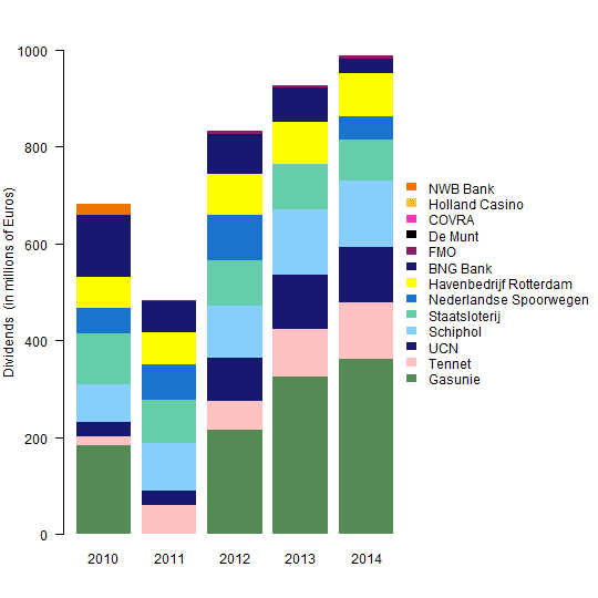
Note that the dividends reported for Havenbedrijf Rotterdam (yellow) were greater than Nederlandse Spoorwegen (midnight blue) in 2014, although this does not agree with the chart shown in the tweet above.


The three main decisions in creating a stacked bar chart are (1) the order of the columns, (2) the order of the stacks, and (3) the color of the stacks.

Order of the Columns

In this case, ordering the columns is easy, because year is ordinal.  If this were not the case, you might want to order the columns by the totals, or some other metric important to the story you're telling with the chart.

Order of the Stacks

It's not clear to me how the companies (stacks) were ordered in the original chart.  It's not alphabetical, and it's not the average annual dividend.  What is it?

I contend that it's good practice to place the least variable stacks at the bottom of the column.  That way, the ups and downs of the more variable stacks do not disrupt the pattern of the less variable stacks.

In order to place those companies with the least variable dividends on the bottom of the bar chart, I ordered the rows by their variance and removed any rows with all zero dividends.
rowvar <- apply(div, 1, var)
div2 <- div[order(rowvar), ]
div3 <- div2[apply(div2, 1, sum)>0, ]
Color of the Stacks

It's good practice to assign colors in a meaningful way whenever possible, delivering more information than simply a random collection of colors.  Color could be used to identify the age, location, or product type of the companies, for example.  It depends on what's important to the story you are telling with the chart.

I thought it would be interesting and informative to define colors for the companies based on whether their dividends increased or decreased over time, on average.  So, I calculated the average annual change in dividends and assigned ordered positive changes to the "YlOrRd" (yellow-orange-red) color set using the R package RColorBrewer and ordered negative changes to the "Blues".
library(RColorBrewer)
change <- apply(div3, 1, function(y) lsfit(1:dim(div3)[2], y)$coef[2])
new.col <- rep(NA, length(change))
sel <- change > 0
new.col[sel] <- brewer.pal(sum(sel), name="YlOrRd")[rank(change[sel],
  ties.method="first")]
new.col[!sel] <- brewer.pal(sum(!sel), name="Blues")[rank(-change[!sel],
  ties.method="first")]

par(mar=c(4, 4, 2, 12), yaxs="i", las=1)
barplot(div3, ylim=1.05*c(0, max(apply(div3, 2, sum))),
  xlab="Year", ylab="Dividends  (in millions of Euros)",
  main="Companies Partially Owned by the Netherlands",
  col=new.col, border=NA, legend.text=TRUE,
  args.legend=list(x="right", inset=-0.55, border=NA, bty="n"))


Reflections

What a difference it makes to have the company with the most variable dividends, Gasunie, at the top of the stack rather than at the bottom.  It makes it much easier to see that the dividends of the other companies were relatively consistent during 2010-2014.

And using color to identify which companies had increasing and decreasing dividends is also very informative.  It makes it easy to see that the dividends of Gasunie increased more and those of BNG Bank declined more than the other companies during 2010-2014.

16 March 2016

Simplify, simplify, simplify

I recently read a post to the Variance Explained blog on How to replace a pie chart.  It referenced a series of 6 pie charts presented in a Wall Street Journal article, What Data Scientists Do All Day At Work.


These 6 pie charts are overkill, as was the collection of bar plots shared on Variance Explained.  What do folks really want to know from the survey results?  How much time data scientists spend on the various tasks.  Can you glean that information from the pie charts?  Not easily.

Instead, a single bar chart could be used to show the average number of hours per day that the respondents spend on various tasks.

dat <- data.frame(
  v1 <- c(11, 19, 34, 23, 27, 43),
  v2 <- c(32, 42, 29, 41, 47, 32),
  v3 <- c(46, 31, 27, 29, 20, 20),
  v4 <- c(12, 7, 10, 7, 6, 5),
  row.names = c("Basic exploratory data analysis",
  "Data cleaning", "Machine learning/statistics",
  "Creating visualizations", "Presenting analysis",
  "Extract/transform/load"))
names(dat) <- 
  c("< 1 a week", "1-4 a week", "1-3 a day", ">4 a day")

# convert the categories to approximate no. hours per day
hrsperday <- c(0.1, 0.4, 2.5, 6)


If, in fact, there is some interest in the variability among the respondents (not just the averages), then a stacked bar chart could be used. Centering the bars on the midline better illustrates which tasks were most common.
library(HH)
likert(dat[rev(order(totals)), ], 
  xlab="Survey respondents (%)",
  main="Time (hours) Spent on Tasks")


08 March 2016

Interactive heatmap of correlation matrix

I saw this tweet yesterday afternoon.
Earlier that same morning I had been perusing a presentation that Karl Broman gave at JSM2015, Interactive graphics for high-dimensional genetic data. The talk included an interactive heatmap of a correlation matrix (slide 7) that seemed like it would be useful to many folks, not just those working with genetics data.

It was time to give it a try.

It couldn't have been much simpler. I had to install the R package qtlcharts, then use the function iplotCorr().
install.packages("qtlcharts")
library(qtlcharts)
iplotCorr(mat=mtcars, group=mtcars$cyl, reorder=TRUE)

06 March 2016

From URL images to animated GIF

I wanted to create an animated GIF using images I found on the internet, the reported cases of Lyme disease in the United States from 2001 to 2014. The images are located on the CDC website for Lyme disease, named map5 through map18.

My original intention was to explore the capabilities of R to do this. However, the solutions I found seemed to rely on another software package, ImageMagick, which I didn't want to install. So, I punted on using R.

Next I tried GIMP (which I already had installed), but I didn't quickly find a way to open/import several images from URLs as layers. So, I punted on using GIMP as well.

Finally, I decided to try GIPHY. GIPHY had an option to create a slideshow where I could pretty quickly (but still, one at a time) copy and paste each of the image URLs to create an animated GIF. I copied each of the images once, except for the last year (2014), which I copied a few times, so that when the GIF goes through its continuous loop, it pauses for the last year of mapped data.

I'm pleased with the results, but not with the process.  I was looking for a solution with code, and came up short.

 
CDC data via GIPHY

I shared the GIF on Twitter ...

02 March 2016

Reporting simple linear regression results in R markdown

I recently wrote an R markdown document that incorporated results from a simple linear regression. I wanted the report to be reproducible (should the data change), so I included references to the summary statistics in the text. I was unsure at first how to put the numerator and denominator degrees of freedom for the F statistic as subscripts. But I found a handy page on math notation in R markdown that provided the solution I needed. The R markdown text and its result are shown below. 

A few things to note.
  • I defined a function, myprint(), to ensure that the numbers I reported in the text had the specified number of decimal places. Simply using round() won't always do this.
  • I calculated the P value from the summary of the fitted model object.
  • I defined a character scalar, statement, to insert the appropriate verbiage in the text regarding significance.
  • I used math notation to incorporate the numerator and denominator degrees of freedom for the F statistic as subscripts.
  • Finally, I noted that the subscripts appeared as expected when viewed in Word or in Firefox, but not in Chrome. Not sure why.
---
title: "Simple Linear Regression"
output:
  html_document: default
---
```{r} 
# define function to easily paste numbers into text
myprint <- function(x, d=2) {
  sprintf(paste0("%.", d, "f"), round(x, d))
}

# fake data for simple linear regression
n <- 100
x <- 1:n
y <- rnorm(n)

# fit the regression, save the F statistic and P value
fit <- lm(y ~ x)
fstat <- summary(fit)$fstatistic
pval <- pf(fstat[1], fstat[2], fstat[3], lower.tail=FALSE)

# text regarding significance
statement <- ifelse(pval < 0.05, "was", "was not")
```
We conducted a simple linear regression of y on x; 
y `r statement` significantly related to x 
($F_{`r fstat[2]`,`r fstat[3]`}$ = `r myprint(fstat[1])`, 
*P* = `r myprint(pval)`).